










Pore Remedy Campaign
2021
2022
Art Direction
Key Visual Agency: Eleven
Photo Assets: DNMT
3D Motion Graphic: Ho-gun Kim
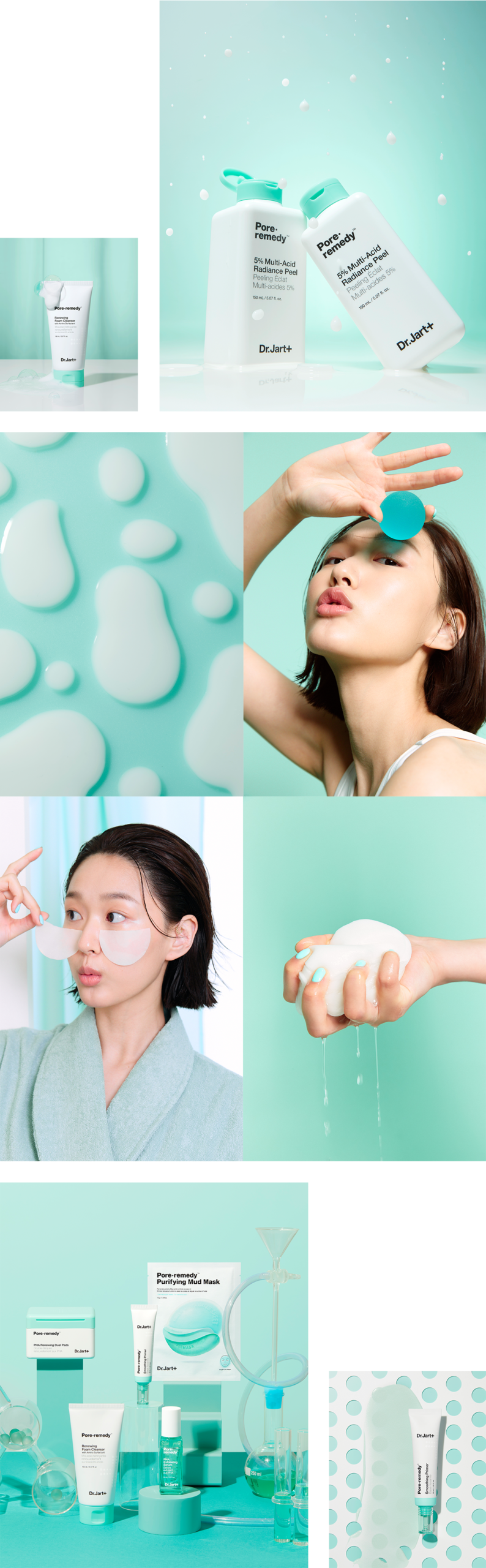
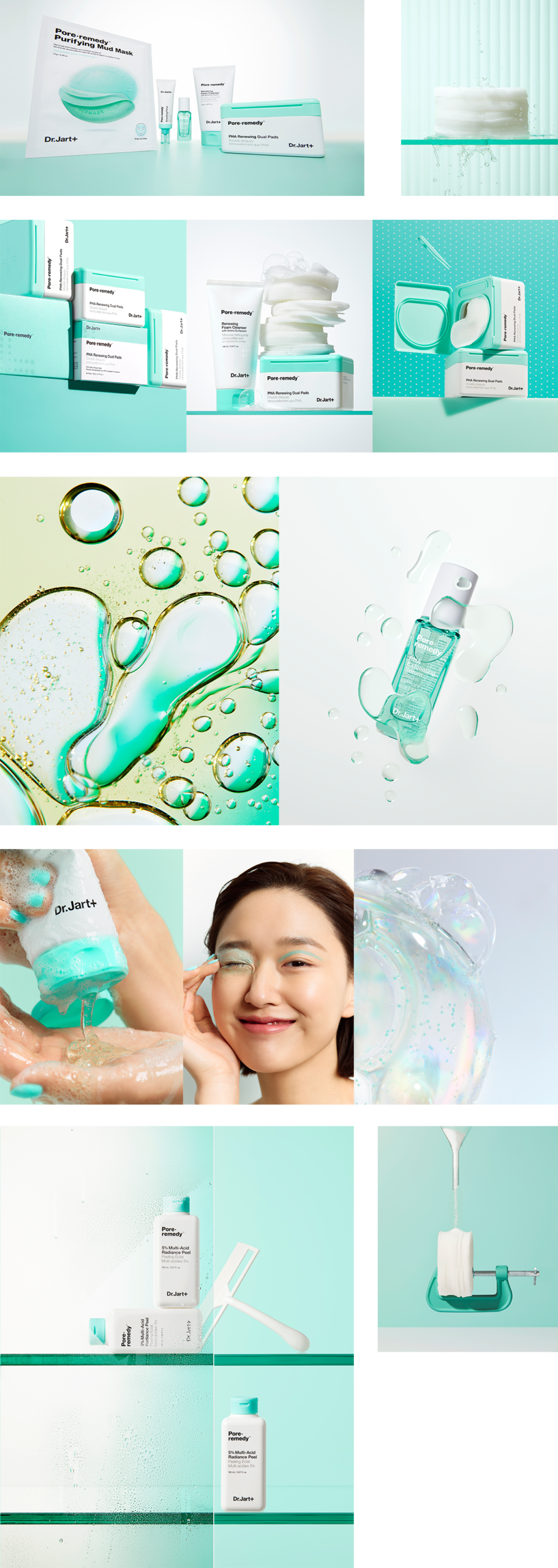
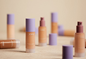
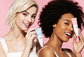
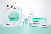
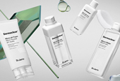
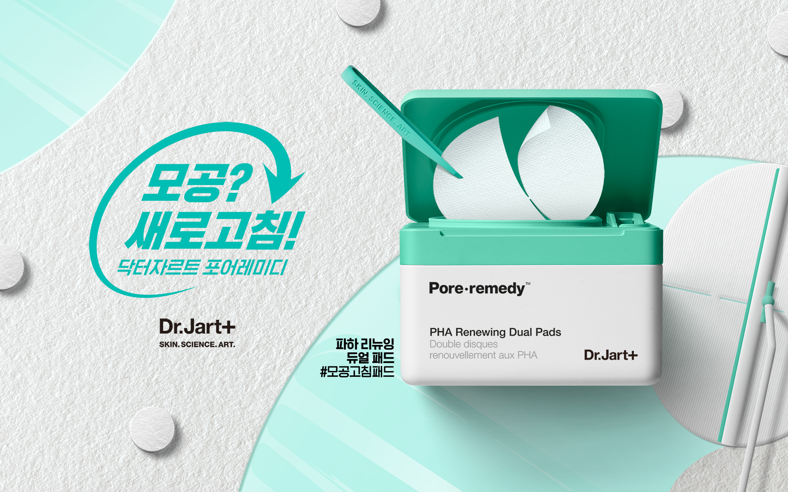
포어레메디 글로벌 캠페인 에셋은 청량감을 주는 민트 컬러를 키 컬러로 설정하고, 모공을 수축/수렴하는 제품의 원리에 기반해 설계된 키 오브제—스퀴저 등—를 중심으로 강한 상징성을 구축하며 일관된 비주얼로 완성되었다. 글로벌 배포를 목적으로 제작된 소셜 에셋 팩은 총 4일간의 촬영을 통해 완성되었다. 제품과 모델의 다양한 컷을 확보해 활용도를 극대화했으며, 해당 에셋은 글로벌 시장의 세포라 매대, DTC의 PDP 등 다양한 미디어를 통해 폭넓게 활용되었다. 또한 4종의 영상은 인스타그램 릴스와 틱톡에 최적화된 숏폼 콘텐츠로 제작되었으며, 제품의 USP와 주요 특장점을 배경 오브제에 반영했다. 전반적으로 키 컬러를 중심으로 한 톤온톤 연출을 통해 통일감 있는 비주얼을 구현했다.
The Pore Remedy global campaign assets were built around a refreshing mint as the key color, establishing strong symbolism through key objects—such as a vacuum—designed based on the product’s pore-refining mechanism. This resulted in a cohesive and consistent visual identity.
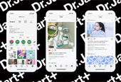
The social asset pack, created for global distribution, was completed over a four-day shoot. A wide range of product and model shots were captured to maximize usability, enabling the assets to be leveraged across multiple channels, including Sephora displays, DTC PDP pages, and other media platforms globally. Additionally, four video assets were produced as short-form content optimized for Instagram Reels and TikTok. Each video reflects the product’s USP and key benefits through background objects, while maintaining a unified, tone-on-tone visual approach centered on the key color.